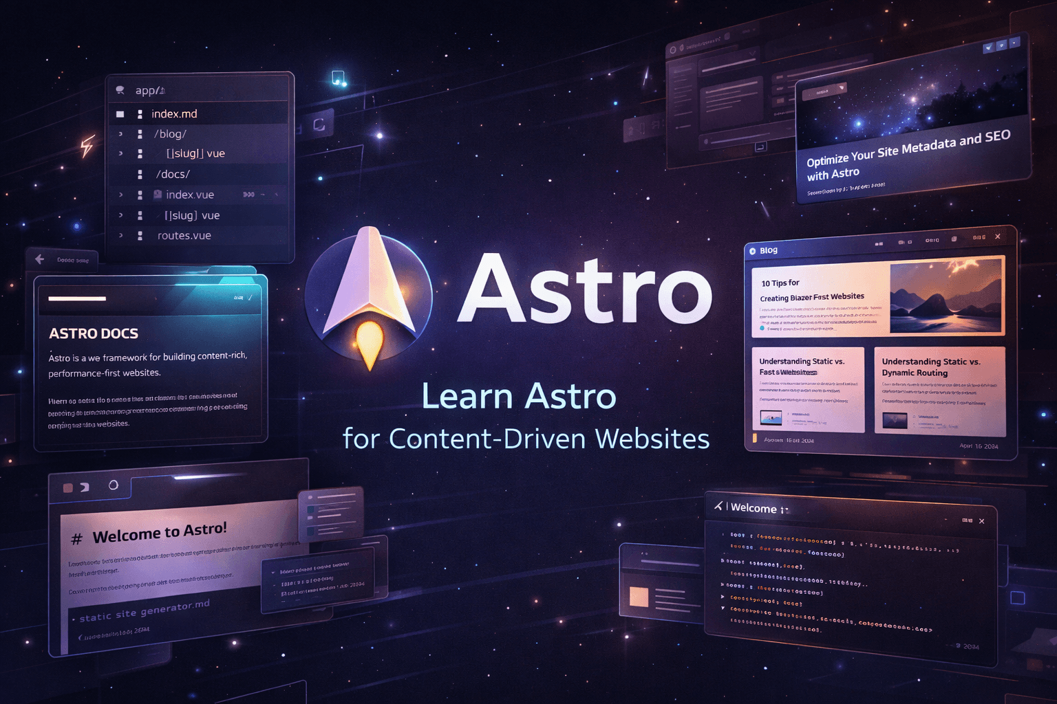
Learn Astro for Content-Driven Websites
A practical roadmap for learning Astro to build fast blogs, documentation sites, portfolios, and modern content-driven websites with strong performance and clean architecture.
Learn Astro for Content-Driven Websites
Astro is a modern web framework built for content-heavy websites like blogs, documentation portals, portfolios, editorial sites, and marketing pages. Its core strength is a server-first model that sends lightweight HTML by default and adds JavaScript only where needed. Astro also supports file-based routing, reusable layouts, content collections, Markdown/MDX, image optimization, and deployment across static or server-rendered setups. (Astro)
Who this roadmap is for
This roadmap is for beginners and intermediate developers who want to build a real Astro site instead of just poking around a starter template. It is especially useful if you want to create a blog, docs site, portfolio, or CMS-driven content platform with strong performance and clean architecture. Astro’s own docs position it as a strong fit for content-driven projects, and the official tutorial teaches it by building a blog from scratch. (Astro)
What you should be able to do by the end
By the end of this roadmap, you should be able to create pages and layouts, understand Astro’s project structure, work with file-based routing, build a blog with Markdown or MDX, organize posts with content collections, add selective interactivity with islands, optimize images, and deploy an Astro project properly. Astro’s current docs also make it clear that modern content collections use the Content Layer API, and that is the direction you should learn now instead of older legacy patterns. (Astro Documentation)
Phase 1 — Understand Astro’s mental model
Before writing code, get this straight: Astro is not trying to turn every website into a giant client-side app. It is built around server-rendered HTML, strong performance, and selective hydration. That means you only ship JavaScript where interactivity is actually needed. This is one of Astro’s biggest differences from app-first frameworks. (Astro)
Focus on:
- Server-first rendering
- Content-driven architecture
- Islands architecture
- Static-first thinking
- When Astro is a better fit than a full SPA
Build:
- A tiny website with a homepage, about page, and blog placeholder
Phase 2 — Set up your first Astro project
The official way to start is with the create astro CLI wizard. Astro’s docs recommend this as the fastest way to scaffold a project, and the development server is then started through the normal package scripts. (Astro Documentation)
Step 1: Create the project
npm create astro@latestThen move into the project and start the dev server:
cd my-astro-site
npm run dev
Astro’s docs use this exact workflow as the standard getting-started path. (Astro Documentation)
Step 2: Understand the basic structure
A normal Astro project includes src/ for source code, public/ for static assets, astro.config.mjs, and package.json. Pages live in src/pages, and Astro turns those files into routes automatically. (Astro Documentation)
A clean early structure could look like this:
my-astro-site/
├─ public/
│  └─ favicon.svg
├─ src/
│  ├─ components/
│  ├─ layouts/
│  ├─ pages/
│  │  ├─ index.astro
│  │  └─ about.astro
│  └─ styles/
│     └─ global.css
├─ astro.config.mjs
├─ package.json
└─ tsconfig.json
Phase 3 — Build your first page step by step
Now the fun part. Let’s build a real first page the proper way.
Step 1: Create a reusable layout
Astro layouts are just Astro components that provide common page structure like <html>, <head>, and shared UI. The docs explicitly describe layouts as reusable page templates with a <slot /> where page content gets injected. (Astro Documentation)
Create src/layouts/MainLayout.astro:
---
interface Props {
  title: string;
  description?: string;
}

const {
  title,
  description = "A modern Astro website"
} = Astro.props;
---

<!DOCTYPE html>
<html lang="en">
  <head>
    <meta charset="UTF-8" />
    <meta name="viewport" content="width=device-width, initial-scale=1.0" />
    <meta name="description" content={description} />
    <title>{title}</title>
    <link rel="stylesheet" href="/src/styles/global.css" />
  </head>
  <body>
    <header class="site-header">
      <div class="container">
        <a href="/" class="logo">AstroStarter</a>
        <nav>
          <a href="/">Home</a>
          <a href="/about">About</a>
        </nav>
      </div>
    </header>

    <main class="container">
      <slot />
    </main>

    <footer class="site-footer">
      <div class="container">
        <p>Built with Astro.</p>
      </div>
    </footer>
  </body>
</html>
Step 2: Add global styles
Create src/styles/global.css:
:root {
  --bg: #0b1020;
  --surface: #121933;
  --text: #e8ecf3;
  --muted: #aab4c3;
  --accent: #7dd3fc;
  --border: #26314f;
}

* {
  box-sizing: border-box;
}

html,
body {
  margin: 0;
  padding: 0;
  font-family: Inter, Arial, sans-serif;
  background: var(--bg);
  color: var(--text);
}

a {
  color: var(--accent);
  text-decoration: none;
}

.container {
  width: min(1100px, calc(100% - 2rem));
  margin: 0 auto;
}

.site-header,
.site-footer {
  border-bottom: 1px solid var(--border);
  background: rgba(18, 25, 51, 0.7);
  backdrop-filter: blur(8px);
}

.site-footer {
  border-top: 1px solid var(--border);
  border-bottom: none;
  margin-top: 4rem;
  padding: 2rem 0;
}

.site-header .container,
.site-footer .container {
  display: flex;
  align-items: center;
  justify-content: space-between;
  padding: 1rem 0;
}

nav {
  display: flex;
  gap: 1rem;
}

.hero {
  padding: 5rem 0 3rem;
}

.hero h1 {
  font-size: clamp(2.2rem, 5vw, 4rem);
  line-height: 1.05;
  margin-bottom: 1rem;
}

.hero p {
  max-width: 680px;
  color: var(--muted);
  font-size: 1.1rem;
}

.actions {
  display: flex;
  gap: 1rem;
  margin-top: 1.5rem;
}

.button {
  display: inline-flex;
  align-items: center;
  justify-content: center;
  background: var(--accent);
  color: #08111f;
  padding: 0.85rem 1.15rem;
  border-radius: 0.8rem;
  font-weight: 700;
}

.button.secondary {
  background: transparent;
  color: var(--text);
  border: 1px solid var(--border);
}

.features {
  display: grid;
  grid-template-columns: repeat(3, 1fr);
  gap: 1rem;
  margin-top: 2rem;
}

.card {
  background: var(--surface);
  border: 1px solid var(--border);
  border-radius: 1rem;
  padding: 1.25rem;
}

.card p {
  color: var(--muted);
}

@media (max-width: 800px) {
  .features {
    grid-template-columns: 1fr;
  }

  .site-header .container {
    flex-direction: column;
    gap: 0.75rem;
  }
}
Step 3: Create the homepage
Astro pages live in src/pages, and each file becomes a route based on its file path. So src/pages/index.astro maps to /. That is Astro’s standard file-based routing model. (Astro Documentation)
Create src/pages/index.astro:
---
import MainLayout from "../layouts/MainLayout.astro";
---

<MainLayout
  title="Learn Astro"
  description="A practical Astro starter homepage"
>
  <section class="hero">
    <p>Modern content-first development</p>
    <h1>Build fast websites with Astro</h1>
    <p>
      Astro is ideal for blogs, documentation, portfolios, and marketing sites.
      It keeps the HTML light, the architecture clean, and the performance sharp.
    </p>

    <div class="actions">
      <a href="/about" class="button">Get Started</a>
      <a href="/blog" class="button secondary">Read the Blog</a>
    </div>
  </section>

  <section class="features">
    <article class="card">
      <h2>Fast by default</h2>
      <p>
        Ship less JavaScript and let content load like it has some self-respect.
      </p>
    </article>

    <article class="card">
      <h2>Perfect for content</h2>
      <p>
        Blogs, docs, landing pages, and portfolios feel natural in Astro.
      </p>
    </article>

    <article class="card">
      <h2>Expandable</h2>
      <p>
        Add React, Vue, Svelte, Tailwind, CMS data, or dynamic features only where needed.
      </p>
    </article>
  </section>
</MainLayout>
Step 4: Create an About page
Create src/pages/about.astro:
---
import MainLayout from "../layouts/MainLayout.astro";
---

<MainLayout
  title="About"
  description="About this Astro starter project"
>
  <section class="hero">
    <p>About this project</p>
    <h1>A clean Astro foundation</h1>
    <p>
      This project was created to learn Astro fundamentals: layouts, pages,
      routing, styling, and content-first architecture.
    </p>
  </section>
</MainLayout>
At this point you already understand one of Astro’s most important building blocks: reusable layouts plus file-based routing. That sounds simple because it is simple, and that is exactly why it scales well for content sites. (Astro Documentation)
Phase 4 — Learn routing properly
Astro uses file-based routing, and dynamic routes can generate multiple pages from local content or external data. This is essential for blog posts, category pages, docs sections, and CMS-fed pages. (Astro Documentation)
Learn:
- Static routes
- Nested routes
- Dynamic routes
getStaticPaths()- Building pages from data
Build:
/blog/blog/[slug]/category/[name]
A future structure might look like this:
src/pages/
├─ index.astro
├─ about.astro
├─ blog/
│  ├─ index.astro
│  └─ [slug].astro
Phase 5 — Learn Markdown and MDX
Astro’s official blog tutorial teaches content creation as a core part of learning the framework. For real blogs, you should learn Markdown first, then MDX when you need richer embedded components inside articles. The docs and tutorials strongly support this workflow. (Astro Documentation)
Learn:
- Frontmatter
- Markdown pages
- MDX pages
- Article metadata
- Authoring workflow
Build:
- 3 basic Markdown posts
- 1 MDX article with custom callouts or components
Phase 6 — Learn Content Collections the modern way
This matters a lot now. Astro’s current docs show that content collections are powered by the Content Layer API, and Astro v6 requires you to use that modern model instead of older legacy collection patterns. So learn the new way from the start and save yourself future migration pain. (v6.docs.astro.build)
Learn:
src/content.config.ts- Defining collections
- Schema validation
- Loading local or remote content
- Generating pages from entries
Example structure:
src/
├─ content/
│  └─ blog/
│     ├─ first-post.md
│     └─ second-post.md
└─ content.config.ts
Example collection config
import { defineCollection, z } from "astro:content";

const blog = defineCollection({
  schema: z.object({
    title: z.string(),
    description: z.string(),
    pubDate: z.coerce.date(),
    tags: z.array(z.string()).default([]),
    draft: z.boolean().default(false),
  }),
});
export const collections = { blog };
That schema-first structure is one of the best things Astro gives you for content work. It keeps your blog from turning into a swamp of random frontmatter nonsense. Beautiful stuff. (v6.docs.astro.build)
Phase 7 — Add styling without making a mess
Astro stays flexible here. You can use CSS, Sass, Tailwind, component libraries, or framework integrations. The important thing is not the hype stack; it is keeping the design system consistent and maintainable. Astro is customizable by design, which is one of its strengths. (Astro)
Learn:
- Global styles
- Component-level styling
- Typography
- Spacing systems
- Responsive design
Build:
- Article layout
- Blog cards
- Author box
- Tag pills
- Dark theme
Phase 8 — Learn Astro Islands
Astro islands are where selective interactivity comes in. The framework’s core pitch is that you don’t hydrate everything, only the pieces that need interactivity. This is huge for blogs and docs because it keeps pages fast while still letting you add search, toggles, accordions, comments, or mini widgets. (Astro)
Learn:
- What hydration means
- Why selective hydration matters
- When to add interactive components
- When to leave things static
Build:
- Theme toggle
- Copy code button
- Search input
- Expandable FAQ
Phase 9 — Images, SEO, and performance
Astro includes official guidance for working with images, and performance is one of its defining selling points. Learn image handling, metadata, semantic HTML, structured page titles, and Open Graph basics early. A content site without SEO hygiene is just shouting poetry into the void. (Astro)
Learn:
- Local vs remote images
- Metadata and social cards
- Semantic HTML
- Good heading structure
- Core performance basics
Build:
- Post cover images
- Meta title and description
- OG image support
- Clean article structure
Phase 10 — Connect a CMS or remote content source
Astro is designed to work with local content, remote APIs, and headless CMS platforms. The docs also describe loaders for local and remote content through the Content Loader API. This makes Astro a strong long-term fit for projects that begin with Markdown and later move to a CMS. (Astro)
Learn:
- Build-time vs live content
- Local content vs CMS-driven content
- Fetching external content
- Page generation from remote data
Build:
- Astro + headless CMS blog
- Tag pages from API data
- Featured content blocks from external source
Phase 11 — Learn when to stay static and when to go dynamic
Astro supports static output, server-rendered output, and server islands. The docs describe server islands as a way to render dynamic or personalized content without sacrificing caching for the rest of the page. That is a smart tool, but use it with discipline. Not every blog needs dynamic wizardry. Sometimes static is not a limitation; sometimes static is just maturity. (Astro Documentation)
Learn:
- Static-first architecture
- SSR tradeoffs
- Server islands
- Performance and caching implications
Build:
- Static blog core
- Dynamic newsletter box
- Personalized widget or server-only component
Phase 12 — Deploy like a professional
Astro’s deployment docs support multiple providers and common CI-friendly workflows. The general guide describes connecting your Git repository to a host for continuous deployment, and provider-specific docs include Vercel and AWS. (Astro Documentation)
Learn:
- Production builds
- Environment variables
- Static deployment
- SSR deployment
- Continuous deployment
Build:
- Git-based deployment
- Custom domain
- 404 page
- Sitemap or RSS setup
Suggested 6-week learning plan
Week 1
Create your Astro project, understand the folder structure, and build static pages with a shared layout. (Astro Documentation)
Week 2
Master routing and create a homepage, about page, blog index, and a dynamic post route. (Astro Documentation)
Week 3
Learn Markdown and MDX. Publish a few sample articles and refine your writing structure. (Astro Documentation)
Week 4
Implement content collections with a schema and generate pages from content entries. Use the current Content Layer approach, not the old legacy setup. (v6.docs.astro.build)
Week 5
Improve styling, images, SEO, and selective interactivity with islands. (Astro Documentation)
Week 6
Connect remote content or a CMS, choose a deployment target, and launch the site. (Astro Documentation)
Best beginner projects for Astro
The best early projects are:
- A personal blog
- A technical documentation site
- A developer portfolio with blog posts
- A product marketing site
- A content-rich landing page
That matches Astro’s core strengths almost perfectly: content, performance, flexibility, and clean rendering. (Astro)
Common mistakes to avoid
Do not treat Astro like a full client-side app from day one. Do not skip layout design. Do not dump unvalidated content everywhere when content collections exist. Do not add interactivity just because your inner goblin likes blinking UI. And definitely do not learn legacy collection patterns when the current docs already moved on. Astro v6 makes that last point very real. (Astro Documentation)
Final take
Astro is one of the strongest choices today for blogs, docs, portfolios, and content platforms. Learn it in this order: pages and layouts first, content second, collections third, styling and performance after that, and dynamic features only when the project genuinely needs them. That path stays clean, scales well, and avoids the usual “cool stack, terrible architecture” trap. (Astro)
Stacks relacionados

Astro + Tailwind CSS for Modern Landing Pages
A beginner-friendly stack for building fast, modern, and visually polished landing pages with strong performance and clean frontend architecture.

Astro with Content Collections + Tailwind 4 + shadcn
A modern portfolio stack for developers, designers, and creators who want a fast personal website, polished project showcases, reusable UI components, and structured content without relying on a full CMS.
SvelteKit + Tailwind CSS for Modern Landing Pages
A flexible landing page stack for developers and startups who want modern design, strong performance, and room to grow into a more interactive web experience.